How this site was built
Two days, one designer, two AI. All me.
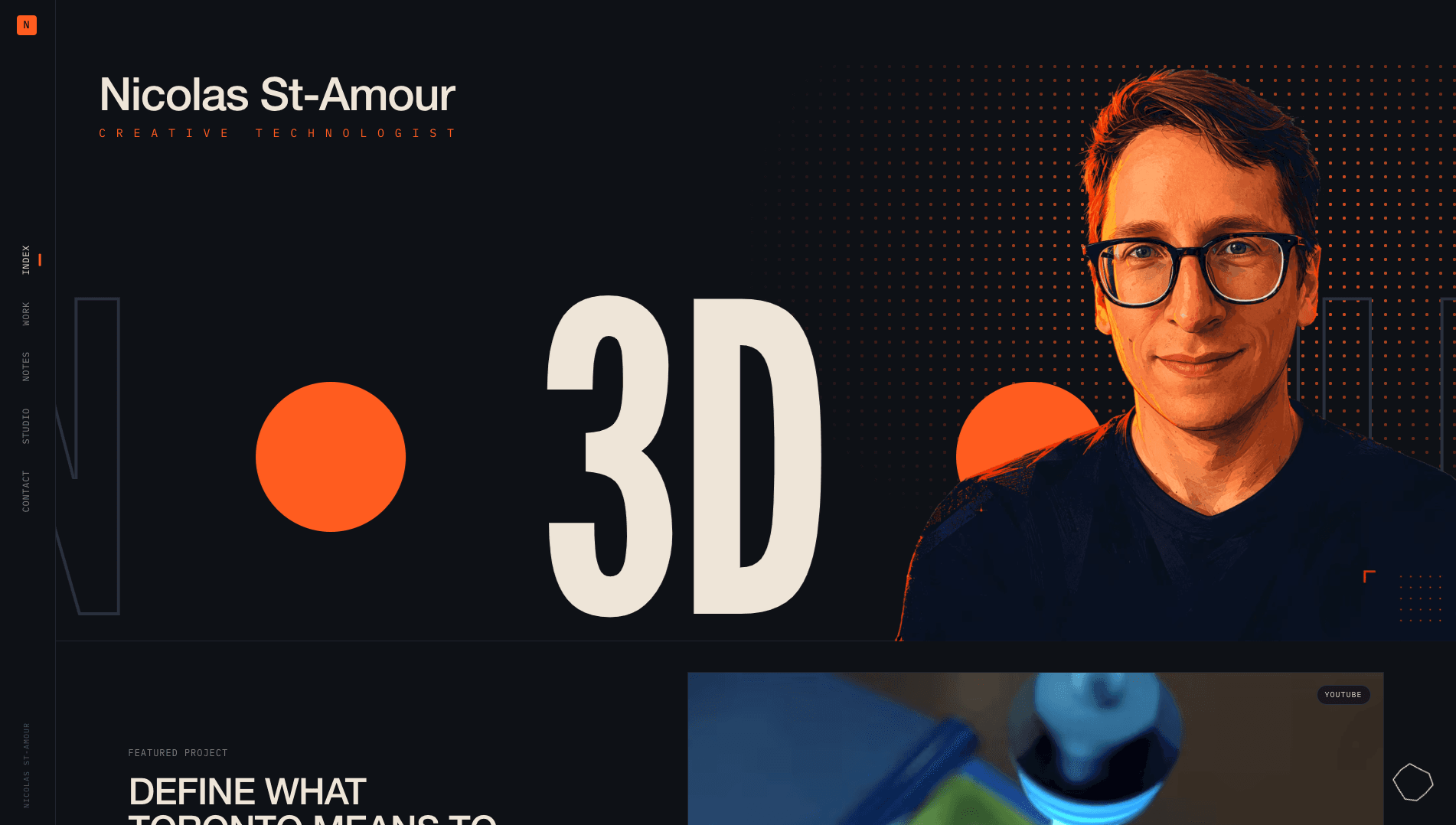
Building a portfolio is complicated and makes you ask a lot of questions: What work do I include? What am I trying to say? How do I make sure I show the right skills? All of those are enough that the secondary problem of how it looks can become overwhelming.
With this project, I wanted to avoid that, and so my goal was speed of implementation and feel. The site I wanted should be a representation of me. Fun, precise and comfortable at the intersection of motion, code, and systems thinking. Every decision had to either serve this vision or it got cut.
I wanted to get this site up as fast as possible and so I set myself a three-day window to accomplish it. This meant I had to be deterministic in my goal while leveraging the best of what AI can achieve.
The collaborators
I worked with two AI tools, each handling their unique roles.
Claude Design handled the visual language. Layout, type hierarchy, motion behaviour, the overall feel. I treated it like a design partner I could iterate with at conversation speed. The feel and vibe were what I knew I wanted from the start but I needed to see options to be sure which direction was right.
I also used the prototype as a way to work out what the real management console needed to do. The prototype shipped with a full content editor, and while it was a temporary one, it helped me ensure there was ample context for the next steps.
Claude Code handled implementation. Scaffolding the Next.js structure, wiring up the Keystatic console, the middleware, the content pipeline, the performance-sensitive parts. The handoff itself was small and concrete: I downloaded the prototype from Claude along with a prompt file that briefed the Claude Code instance on what to build and how. From there I stayed close to every decision, read every diff, and owned the architecture. The amazing part compared to a solo build was the sheer velocity I could accomplish this at.
The two-day timeline wasn't a constraint on vision and scope, instead with the help of these tools and extensive guidance, it was a realistic timeline.
The look
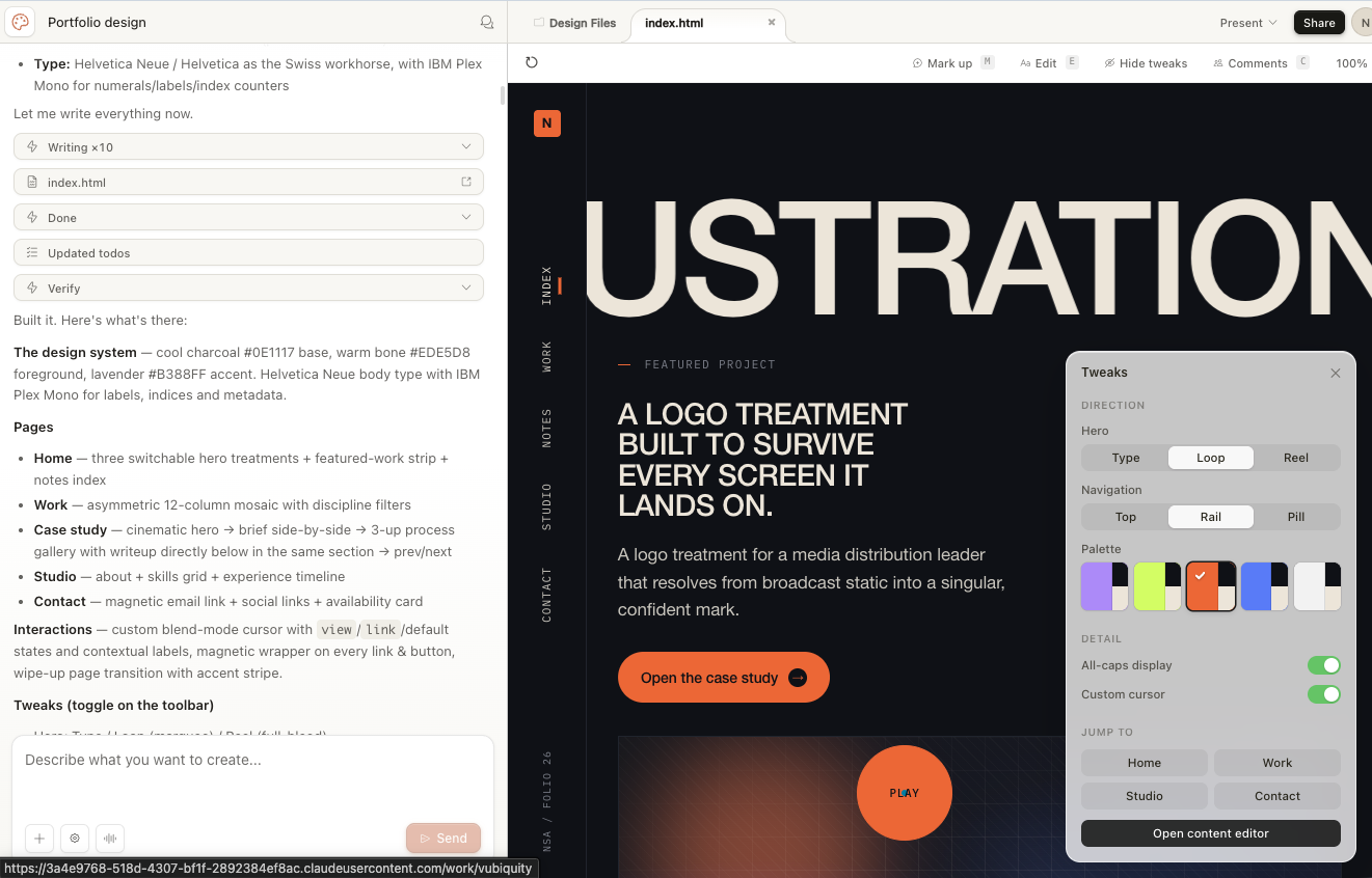
My instinct with Claude Design was to treat it as a design partner. That approach proved to be the best way forward cause honestly, I was like any client. I didn't truly know what I wanted, not until I saw it. That's where Claude really showed its value. It handed me a TweaksPanel: a floating dev-time control surface that let me flip between palette options, navigation patterns, hero treatments, and a few typography toggles in real time. That panel is where most of the early calls actually got made and helped me understand my vision.
The palette
Claude's default was lavender and suggested five other options; each of which had their pros and cons.
The acid green tempted me.
However, it rang too much like Apple Fitness or Nike, and I wanted to be distinct from that branding.
Red and orange (usually my personal favourites anyway) screamed what I wanted Action.
Once I saw the orange and dark blue render together, I was certain. It read as technical, forward-looking, with the right level of colour pop to give that coder / hacker energy while still helping images and video pop.
The type
I knew I wanted this site to be type focused. I've always been into design and I wanted this site to feel like it stepped out of a magazine. That's where the All-caps lean and large sections for copy extended from.
The navigation
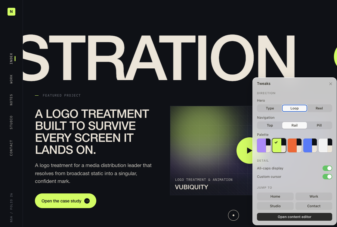
Claude proposed three nav variants: a traditional horizontal top bar, a vertical sidebar rail, and a corner brand with a floating centre pill.


The rail (not pictured) won because it's the most unique and felt the most like something I could own. The rail also gave the home hero room to breathe horizontally, which is what made the rotating-list marquee work.
The stack, briefly
- Next.js (App Router) with TypeScript in strict mode
- CSS Modules: co-located, scoped, no purge complexity
- Framer Motion used narrowly: transitions, cursor, magnetic hover
- Keystatic: Git-backed CMS. Every edit becomes a commit. No database to back up.
- Vercel: zero-config deploys, edge middleware, commit-to-live in roughly sixty seconds
The performance budget is under 90 kB. My goal was always that this site was my brand and ensuring it worked well at different sizes and internet speeds was a must.
Fun details people miss
Most of the cool stuff isn't loud. It's between the words.
The cursor has physics
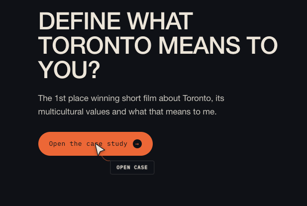
The original cursor in the Claude Design prototype was simpler: a dot, a ring around it, and a small text label that followed the pointer. It worked, but it didn't feel playful enough, and the goal of this site is to highlight my creativity, so I wanted something more distinct. The location of the dot also made the text overly difficult to read.
Through revisions I landed on two things I liked: the label belonged in its own bubble, and a physics approach added the missing fun I wanted. Claude was actually very resistant, to my surprise, but I'll detail more on this later.
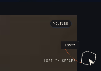
The production cursor sprouts a label pill based on the local context; "View", "Open case", "Engage". All of them leashed to the cursor on a thin gravity-bound rope. It curves and trails the way an actual rope would and getting that right was key for me.
The part that really makes me happy is how the edge handling works. When you push the cursor toward the right side of the screen, the label flips to the opposite side of the chevron so it stays in the viewport instead of clipping behind the window frame. The rope segment length adapts on the fly, helping to make it feel alive.
The 404 page is a real game
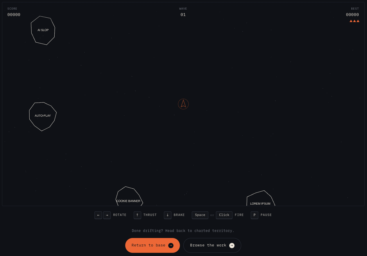
Type a URL that doesn't exist and you get Adrift; a full Asteroids reimplementation.
Everyone knows Google Chrome's dinosaur game Steve and like everyone I've wasted hours playing that when my internet breaks. I truly love easter eggs like that and I wanted my site to have one too. The theme was simple, what happens when you hit a 404, you are lost, the link you tried put you somewhere uncharted.
What's more uncharted than space? All I needed was a space-based game you could play that could run forever and be fun. Asteroids felt like the perfect angle. Graphics are simple, and the gameplay is known.
For mine, the asteroids carry the names of annoyances that anyone in a creative/technical field will catch right away: Scope creep, Comic Sans, Lens flare, AI slop, Cookie banner, Auto-play.
Every fifth wave a mothership arrives. It telegraphs its entrance with a pulsing INCOMING marker at the edge it'll appear from, then slides into the playfield and starts shooting at you.
The tough part was ensuring the game played well on mobile too. I had to lower the asteroid count and increase the layout size. Tweaking the touch controls until they felt right.
How to ensure discovery...
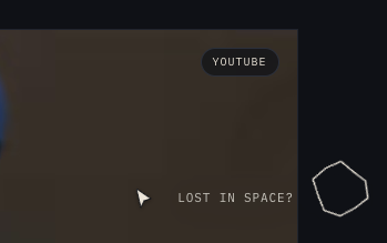
I had built this site, added the game, but what's the point of a game if no one can find it? So I thought, why don't we add a little icon to the home page; something innocuous and small with just enough movement to catch your eye and make you think: "What's this?"
The asteroid felt like the perfect version; giving users a hint without screaming out and being distracting.
The home hero is one layered composition
The hero looks like a magazine spread, but it's actually five layers stacked in one row: a dot-halftone bloom behind the figure, a giant scrolling marquee with keywords related to my skills, a hairline divider at the row's bottom, the name + role identity block at top-left, and a transparent portrait pinned to the right edge of the viewport.
My goal was to make the hero feel like a living magazine spread and I could not be happier with the outcome. I ran an image of mine through Nano Banana 3 to create the painted graphic and then removed the background in Photoshop, upscaling and tweaking colours until they felt right.
What changed from origin to now
A lot changed over two days. While the main scaffolding was built out in two sprints, the rest required careful refinement and measured prompting.
Where Claude Code needed hand-holding
The cursor physics.
Even after I'd decided I wanted the rope, the bubble label, and the edge-flipping behaviour, Claude Code didn't really understand the physics idea. The first few passes returned a label that floated, then a label that snapped, then a label that lagged but without any actual rope behaviour. It took a lot of detailed prompting to get what I wanted; being specific about gravity values, the actual constraint relationship between segments, and converting my perception of feel into something a computer could understand.
The avatar over the marquee.
The home hero composition is five layered elements, and the relationship between the portrait and the marquee required a very detailed picture to be painted. Claude frequently misunderstood my intention. I had to iterate through versions where the portrait clipped the words, versions where the marquee blew out behind the figure, versions where the hairline divider ran through the avatar's shoulder instead of stopping at it. It was frustrating, but with enough clear planning and handholding Claude got there.
Both of those moments were a useful reminder: AI is fast, but it isn't a mind-reader. The cases where I had a precise visual in my head were the cases where I had to be precise back.
Closing
Honestly? The moment I knew this was going to work was the first time I saw the design in production. With my avatar. That moment was like nothing else and really cemented to me that with the right workflow, you truly can achieve anything.
AI didn't replace the work. It compressed the time between I see what I want and that's what's on the screen. It never replaced the intentions, the orchestration, and the product calls that only I could make. Even if I didn't code it, at the end of the day this site is as much mine as anything I did code.

If there was one takeaway from this project, it would be: AI can't ever replace planning and understanding.
AI is like the best junior team member you've ever had, but similarly, it needs direction and guidance. If you use AI to skip steps, with the hope that you will get where you need, you'll end up with something that is broken or surface level. The true leaps and bounds AI makes possible are won on the back of planning, intentionality and workflow guidance.